One of the activities we have done with our faculty, staff and students is what we call “mini design sprints.” A design sprint is an activity that takes place over the course of a week, and involves a group of participants (see sidebar); we are calling these mini-design sprints because they can be completed in under an hour, and while they might be done in a group setting, they can also work one-on-one.
Our first mini design sprints were with colleagues in the library. We set up meetings with different groups across the libraries, and invited anyone to attend; we generally had four to six people show up. After a brief introduction, they are given a piece of paper with four mobile phone templates on it (downloaded from Sneakpeekit) and asked to sketch a design in response to a question. For example:
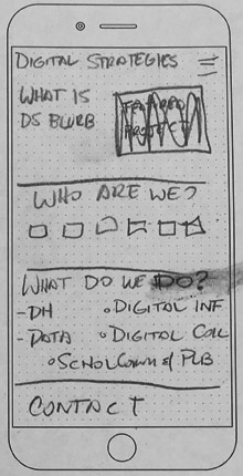
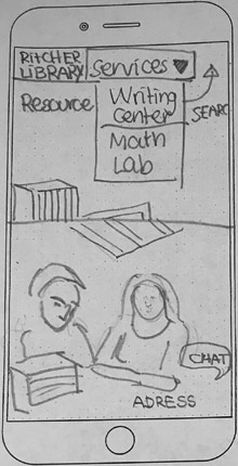
Design your department page in mobile - show the most important content/functions for you or your patrons in the visible area of the screen. You can test out more than one idea.
We project the question on the screen so people could easily refer to it. The participants are given six or eight minutes to complete their sketches. (We started with eight minutes then discovered that was a bit too long.)
Design Sprints… In 100 Words
On Day 1, the group (designers and non-designers) gets together to go over a scenario or problem needing a solution. They discuss the who, what and why. On Day 2, the group sketches possible solutions to the problem. The process may take anywhere between 5-20 minutes. On Day 3, the group reviews the sketches and votes on the solution to implement. On Day 4, the design team produces a low-fi working prototype or proof of concept to illustrate the solution. Finally on Day 5, the prototype is tested with actual users and feedback is collected.
Once the sketches are completed, one of the facilitators goes around the room and takes a picture of each template sheet with their phone and uploads it to Box (the campus’s shared document storage system). We then navigate to that Box folder on the projected screen, and all look at each template in turn. The creator quickly describes what they have done and others may ask questions or give feedback. Uploading to Box is also useful if you have people teleconferencing in - they can share their sketches and view the other sketches easily.
 Department Design Sprint Example
 Student Design Sprint Example
Keen readers of this blog will know that we produced a Master Discovery Report with findings from our earlier discovery activities, and a series of recommendations based on this research.
After the participants have put down their pencils, and discussed their sketches, we put up a new note on the screen:
Would the following recommendations from our UX research make you modify your design?
We then bring up, slide by slide, a series of recommendations that we thought might inspire conversation. Each recommendation is followed, in parentheses, by its source. For example, again from our internal departmental sessions:
Associate people with services on second level or departmental pages (Staff Focus Groups).
Provide easy ways for students to communicate with library staff on the website (User Testing: One on One).
The answers to these questions can be quite different from department to department, depending on how regularly they interact with the public. That is, a cataloger in our Metadata & Discovery Services department might have relatively minimal interactions with the public, while a member of Learning and Research Services, would have regular contact. In each case, it’s worth discussing what is the best way of providing service to the public via the web.
Another recommendation we put up, again during the departmental design sprint:
Make sure popular tasks and resources are easily available from the homepage (User Testing: One on One).
This recommendation was from looking at the overall Libraries’ website home page, but we were curious how it might translate to each department’s splash page. It also led to discussion about what exactly are your department’s most popular tasks (from a web perspective) and then, how do you know that they are popular?
Overall, we found that mini design sprints structured in this way worked quite well. Even if people were not accomplished artists, the subsequent discussion questions gave them a chance to participate and think a bit more about what they wanted the new website to accomplish. We chose to use a mobile view because it forces users to focus on the most important tasks. We also discovered with a trial run-through of a desktop template that there was just too much room to fill. In mobile, the participants always had the option of adding additional content below the fold–i.e., in one of the other three squares provided on the print out.
For our student and faculty sprints, we did things slightly differently because of scheduling issues. It’s challenging enough scheduling people who work together, but finding a time and a room for a diverse group of students or faculty is next to impossible, so we chose instead to do them one-on-one. With faculty, we asked librarians to reach out to their faculty to find willing participants; for students, we set up our usual guerilla testing table, complete with free coffee, and acquired participants that way.
With the first round of design sprints done, we now have more ideas to help with prototyping, we have raised awareness of the redesign, and we have given more people an opportunity to participate in the process. Those are the three things we hoped to achieve with these mini design sprints, and we feel that this process was successful in achieving them. We found referring back to recommendations from our report was an excellent way of generating discussion. In terms of things that might be improved, it would be nice to find a better way to get broader faculty participation - but this is true of all our of UX activities.
Using our UX Research
We have spent a good deal of time on our UX and research activities, so we want to be sure we make good use of them. As such, we are trying to refer back to the recommendations from the Master Discovery Report whenever possible. In the case of these mini design sprints, it was to focus the conversation. As we build out prototypes, we want to refer back to research for why we have made certain decisions. And then as we unveil the new site, we hope to have a key that can explain certain aspects of the new design. There is always going to be a significant component of our new site that relies on industry best practices or the years of experience of the Web & Application Development team, or that is just trying something new; but we want to ground as many decisions as possible in UX research.


